Tate Modern
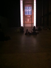
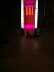
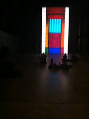
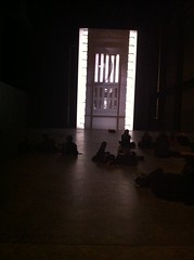
Tacita Dean - Turbine Hall - film


Billed as a love letter to film - proper film as opposed to digital - clear, strong colours, unpixilated, able to be superimposed and sliced together. Large screen, space for people to lie down in front of it, which they did. Gathered people staring up at it - huge vertical screen. Darkened around to enable it to be seen better.
Gerhard Richter - retrospective
Crowded exhibition. I don't know why but I was amazed that he did both super-realistic paintings from photos and very abstract. Really like the 70s paint swatch painting (it reminded me of my old bathroom at my parent's house - Dad and I spent an afternoon papering it with paint swatches - it made for a very colourful two walls - great for staring at during a long soak). Also the huge canvases with thick layers which were pulled across the canvas - textured, colour contasting between layers.
Tate Britain
Barry Flanagan
Very quiet. Early Flanagan (pre-hare sculptures) - lots of use of formless material (canvas, sand, rope) - large columns made of canvas filled with sand to give them structure, sticks tied together - sticks and coloured fabric. Liked the colour of rope and sand against the parquet floor. Defying physics - canvas help up against the wall like a painting using sticks. Carving in stone that follows the seams in the rock - imagery that evokes the stylised pictues used by early humans.
Apocalypse - John Martin
While Barry Flanagan was empty and therefore easy to look properly, Apocalypse was packed. The underground poster was quite striking and made me want to see the exhibition. Poplular pictures, very commercial artist - he often painting several versions of the same picture and then made an etching for further sales. This exhibition showed multiples of the same image together. He cottoned on to an idea of slightly off-centre composition based in a circular or spiral shape, backgrounds were pale, foregrounds dark. Lots of drama. But the composition was all too similar and in the end I found it too commercial. Would have preferred to see only a couple rather than several rooms full. The quantity didn't increase the drama, instead making it seem repetative and formulaic.
I'm with you on Richter's squeegeed canvases... "November" (in St. Louis) really grabbed me. It had so much visual depth... it shimmered from a sonogram-ish background to definate brightly colored scrapes in the foreground. I always enjoyed his blurry photorealistic work too. ("Woman Descending the Staircase" at the Art Institute of Chicago) Tuymans would deny Richter's direct influence but I'm not so sure. Great post, thanks.
ReplyDelete